Get Free Consultation!
We are ready to answer right now! Sign up for a free consultation.
I consent to the processing of personal data and agree with the user agreement and privacy policy
In today’s fast-paced digital world, a website is not just a placeholder on the internet—it’s the heartbeat of your online presence. A professional website communicates your brand’s story, builds trust with your audience, and serves as a powerful tool for generating leads and conversions. At Devline Studio, we understand that every business is unique, and your website should reflect that individuality while offering seamless functionality and exceptional user experience.
Our approach to web design and development combines modern aesthetics, intuitive navigation, and scalable technologies to create websites that are visually appealing, fast, and secure. From planning site architecture to integrating advanced features, we ensure that each element is designed with purpose. We focus on responsive design, making sure your site looks perfect on desktops, tablets, and mobile devices alike.
Beyond visuals, we implement practical solutions that help businesses grow. Whether it’s integrating content management systems, optimizing performance, or setting up analytics, our websites are built to support long-term growth. By merging creativity, technical expertise, and strategic planning, we help your brand establish a strong online footprint that engages visitors, converts them into loyal customers, and sets you apart from competitors in a crowded digital marketplace.
The foundation of every successful website lies in its user interface (UI) and user experience (UX). These elements dictate how visitors interact with your website, navigate pages, and absorb content. At Devline Studio, we start by analyzing user behavior and mapping out intuitive navigation paths. This ensures that each visitor can find what they need quickly and efficiently, reducing frustration and increasing engagement.
A clean and visually consistent layout is essential. We carefully select typography, spacing, and visual hierarchy to guide the eye naturally through the site. Color palettes, including our signature blood red, slate blue, and neutral tones, are used strategically to reinforce branding while maintaining readability and visual comfort. Icons, buttons, and interactive elements are designed to be functional yet aesthetically pleasing, creating a balance between beauty and usability.
Our UX process also considers accessibility standards, ensuring that people with disabilities can interact with your site seamlessly. This includes clear contrast ratios, keyboard navigation, and screen reader compatibility. Each element is tested and refined based on real user feedback, ensuring optimal performance.
Effective UI/UX doesn’t just improve usability—it drives business results. Websites that are easy to navigate, visually engaging, and emotionally resonant lead to longer visit durations, lower bounce rates, and higher conversion rates. Our goal is to craft an experience that reflects your brand values, resonates with your audience, and achieves tangible outcomes.
In an era where the majority of users browse on mobile devices, having a responsive website is no longer optional—it’s a necessity. Responsive design ensures that your website adapts seamlessly to any screen size, whether it’s a smartphone, tablet, or large desktop monitor. At Devline Studio, we approach responsive design as a critical component of overall UX.
We begin by analyzing the structure and flow of each page, ensuring that content is flexible and images scale properly across devices. Buttons, forms, and interactive elements are made touch-friendly for mobile users, enhancing ease of use. Beyond layout, we optimize for performance by compressing images, minifying scripts, and reducing server requests. This ensures fast load times, which is crucial for both user retention and search engine rankings.
A mobile-first approach also improves SEO performance. Search engines prioritize websites that perform well on mobile devices, making responsive design a strategic decision that directly impacts visibility and organic traffic. Our designs strike a balance between visual appeal and technical optimization, ensuring that your mobile site is as engaging as the desktop version.
Additionally, we focus on creating a cohesive experience that mirrors your brand identity. From color schemes to typography and interactive components, every element is consistent across devices. This builds trust and recognition, reinforcing your brand every time a user interacts with your site.
Ultimately, responsive design is about more than aesthetics—it’s about delivering a seamless, high-quality experience that meets user expectations, increases engagement, and drives conversions.
Elementor provides unparalleled flexibility in creating modern, dynamic web pages without compromising on design quality. At Devline Studio, we leverage Elementor to craft fully customizable pages that are both visually stunning and functionally robust. This enables us to rapidly implement designs, test variations, and adjust layouts according to project requirements.
With Elementor, clients have the ability to manage their content seamlessly once the website is live. From editing text to adding new sections or media, the platform ensures ease of use for non-technical users. We structure templates and blocks to maintain consistency across the site while allowing flexibility for growth and updates.
Interactive elements, such as sliders, accordions, and call-to-action buttons, are implemented to engage visitors and guide them through the website journey. Animations and hover effects are applied judiciously to enhance visual appeal without compromising performance.
By integrating Elementor best practices with responsive layouts, our websites remain scalable and adaptable. Businesses can introduce new services, promotions, or campaigns without major structural changes. This future-proof approach ensures long-term usability and maintains a professional appearance.
Moreover, we optimize each page for SEO, speed, and accessibility, ensuring that aesthetic flexibility does not come at the expense of technical quality. Elementor’s modular approach, combined with our expertise, allows for fast deployment, easy maintenance, and ongoing scalability.
Even the most beautiful website will fail to convert visitors if it loads slowly. At Devline Studio, performance optimization is a key part of our web development process. Fast-loading websites enhance user satisfaction, improve SEO, and increase conversion rates.
We begin by analyzing site structure, server response times, and asset sizes. Images are optimized without losing quality, scripts are minified, and caching techniques are applied to reduce load times. We also implement content delivery networks (CDNs) to serve assets quickly across different regions.
Beyond technical enhancements, we streamline the user experience to reduce unnecessary requests and eliminate bottlenecks. Lightweight designs, clean code, and asynchronous loading of non-critical scripts ensure the site remains performant under heavy traffic.
Performance also has a direct effect on search engine rankings. Google considers page speed as a significant ranking factor. Websites that load quickly not only retain users but also gain higher visibility organically.
Our approach combines aesthetics with technical excellence. Each element, from images and fonts to interactive components, is optimized to ensure smooth operation without compromising design integrity. Regular testing across devices and browsers ensures consistency and reliability.
In summary, performance optimization is about creating a website that is fast, reliable, and enjoyable to use. By prioritizing speed, we improve user engagement, boost SEO rankings, and maximize the impact of your online presence.
A website should not only serve current needs but also grow with your business. At Devline Studio, we focus on scalable, future-proof development practices that ensure your website remains relevant, secure, and adaptable over time.
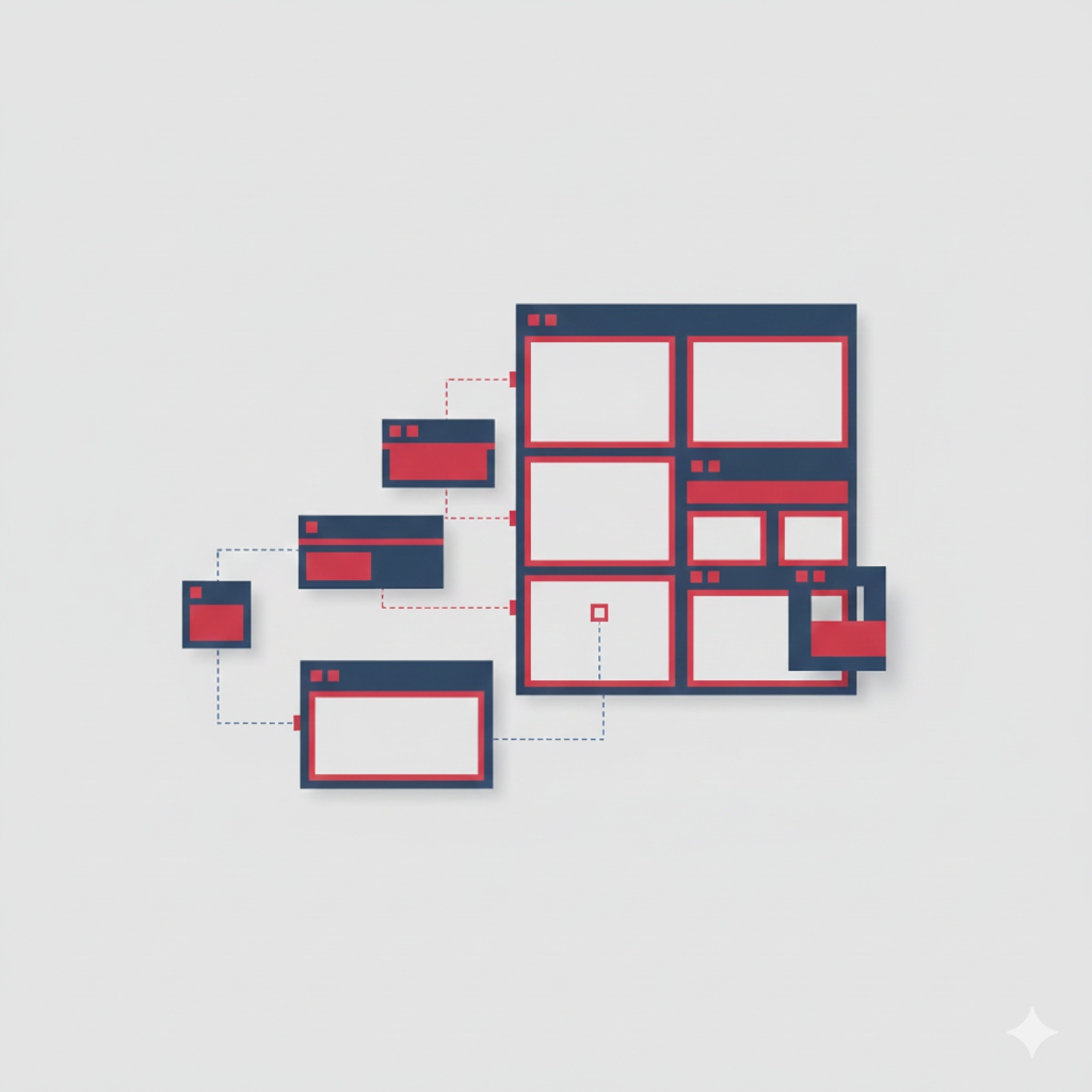
We use modern coding standards, modular structures, and flexible frameworks to create websites that can be easily updated or expanded. This includes integrating content management systems, e-commerce functionalities, and third-party tools that support future growth.
Scalability also involves planning for traffic spikes, additional features, and increased user interaction. By anticipating growth, we implement technical solutions such as optimized databases, caching strategies, and performance monitoring to ensure long-term reliability.
A future-proof website is also easier to maintain. Developers and non-technical team members alike can make changes or add features without risking structural integrity. This adaptability reduces costs and allows businesses to respond quickly to new opportunities or market changes.
Security is another crucial aspect of future-proofing. Regular updates, best practices for code hygiene, and monitoring ensure that the website remains safe against vulnerabilities while maintaining performance.
Ultimately, scalable and future-proof development ensures that your website is not a static asset but a dynamic platform capable of supporting your brand’s evolving goals. By combining foresight, technical expertise, and strategic planning, we deliver websites that grow with your business while maintaining quality, performance, and user satisfaction.
We will answer any questions you may have about our online sales.
We are ready to answer right now! Sign up for a free consultation.
I consent to the processing of personal data and agree with the user agreement and privacy policy